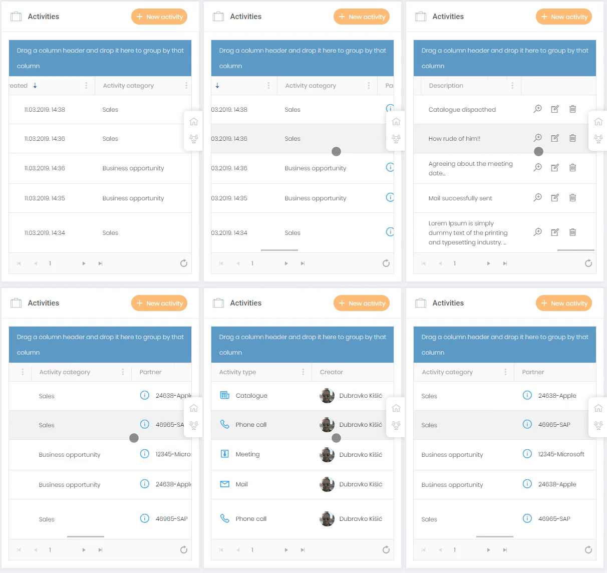
The concept of responsive design suggests that the web site layout should adapt well to every device on which it is used. It’s fairly easy to apply this concept to most elements, but DataTables aren’t one of them. In this blog post I am going to demonstrate how to make the most out of the Kendo grids on mobile displays. Kendo is one of the most popular frameworks which comes with nearly 100 widgets. One of the most used widgets is definitely Kendo grid. It is basically a DataTable enriched with many controls which help users manipulate the data in any way they like. You can see how a regular Kendo grid looks in a picture below.

It is super clear on wider screens, but on smaller screens it’s very hard to display data in desired way, especially in a situation where grid consists of 10+ columns.

As you can see on the picture above the grid looks decent on mobile phone, but it's hard to read from it (and it consists of only 8 columns). Kendo team has made some demos which show how to make grid responsible (demo1 and demo2). The first demo offers a solution which is fairly close to mine and the second one is more about hiding columns than adjusting it to mobile displays. Both of these solutions demand extra configuration and my goal was to avoid that. So I decided to find a new and clean solution which won't demand changing dozens of grids I have in my project. As I said, first solution is similar as the one I am going to show you, but it demands extra configuration for every grid while mine can be done with a little bit of CSS (LESS) and a couple of JS functions.
In the picture above you can see LESS file in which styling is specified. With media query we are targeting smaller devices and setting elements of which the grid consists (mostly table elements) to block display. We are also adjusting rows and cells of grids for mobile display, hiding what is not necessary and for each cell we use CSS generated content (:before) to apply the label which shows us the title of every cell.
Nothing much to say here. When the document is ready we call the function setKendoGridsForMobileDisplay() in which we are iterating through every existing grid and binding the kendoGridDataBound() function.
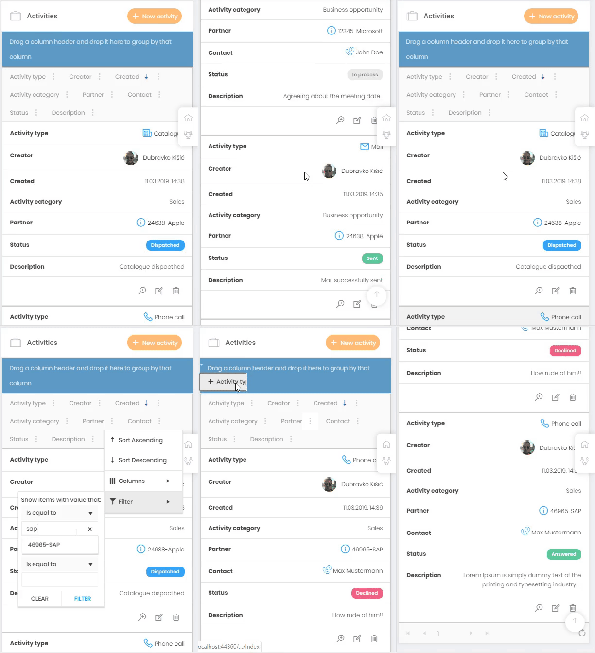
As you can see we have two functions on the image above. First is simple, it just removes " " from elements provided as parameter (kendo grid leaves " " on empty footer cells). The responsibility of kendoGridDataBound() function is to append the attribute "data-title" to every cell in grid (title is the name of the column that cell belongs to), both in grid body and footer (td:before rule in CSS reads this attribute and sets it as content of cell). This example is also adjusted for hierarchical grids and grid groupings. So to conclude, we've succesfully transformed Kendo grid which is naturally unhandy on smaller devices to mobile-friendly version and we've done it with minimal effort, by adding few CSS rules and JS functions. The GIF below shows the end result. Grid is 100% adjusted for mobile display while every control is preserved.

If you have some grid that you're opening additionally you should register event which will recognize that the grid is being instantiated and loop again through every grid on page. You can achieve this by adding Events(e => e.DataBinding("setKendoGridsForMobileDisplay")) to grid configuration.
Files are here.


